

OVERVIEW
In collaboration with our Customer Support team, we discovered that users that got approved for funding needed help understanding the funding plans they were getting without the help of a representative from 8fig. Instead, the CS team would have to talk the user through the plan and sell it to them. As a result, CS had to spend most of their time answering the same question multiple times throughout the day, and users signed offers at a very low rate.
This project aimed to productize the calls our CS team were having with users by creating an exciting and educational experience so the amount of CS tickets would reduce and more offers would be signed.
BACKGROUND
8fig is a platform that provides funding to eCommerce sellers. I joined the company in May 2022 as one of four UX designers who support product design across the entire business. I led UX and UI initiatives in the onboarding process, from the first interaction to activating a funding plan.
ROLE
Product Designer
User Research
Visual Design
Prototyping
Copywriting
Testing
TIMELINE
January 2023 - March 2023
DESIGN PROCESS
We implemented the double diamond theory and lean UX process to guide our decision-making and timeline. The goal was to incorporate discovery, definition, ideation, and implementation for this project.

Image source: Creative Commons
UNDERSTANDING THE PROBLEM
After a user submits an application and connects their eCommerce store with 8fig's platform, they wait a few days for our risk team to approve them for an offer. Most users who receive an offer don't end up signing it, and our team wanted to know why. In collaboration with our Customer Support team, we found many aspects of the offer that users needed help understanding when presented with it for the first time. They had to talk to a member of the team in order to feel comfortable signing the contract because they wanted to understand in full detail what kind of funding they'd get. We wanted to find a solution that would reduce contact with the CS team and increase user understanding and trust in the funding plan provided.
My research included
1. Understanding the user's goals and needs
2. Uncovering pain points with the existing user journey
3. Determining the success of the tasks measured


Original offer design
GATHERING INSIGHTS
After interviewing a group of users, we found the same few pain points repeated throughout
-
Don't understand the “participation” aspect
-
Offer feels “cluttered”
-
Don’t understand “Cost of Capital”
-
Don’t understand the remittance table
These are the common issues we decided to focus on finding solutions for
WIREFRAMING
We worked towards solutions to address the pain points identified.
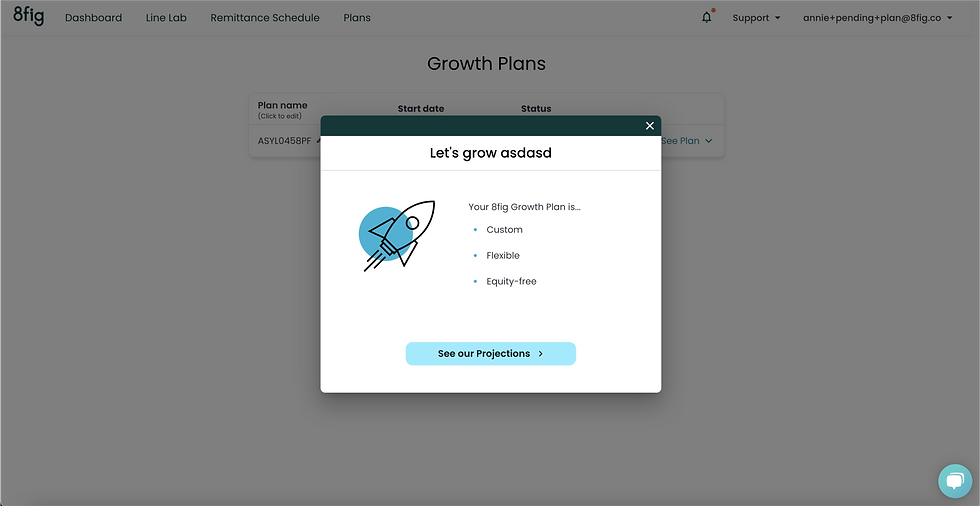
1. Breaking information into “bite-sized” pieces to help the users digest information better and "de-clutter" the offer
2. Explaining the offer in “weekend language” to help users understand information presented
3. Making the plan page a direct summary of the “sales pitch” to remind users of information they just learned in the offer presentation
Since we learned from research and analytics that about 60% of our users view their offer on a mobile device, we designed our wireframes on mobile first.


VALIDATING
Our validation process included presenting the wireframes to the company's stakeholders and the customer support team. After a few rounds of iterations, the stakeholders approved us to proceed with the information presented. In addition, the customer support team validated that the content presented in the plan summary and offer presentation answered the questions they get most frequently from users.
If I had time to continue this project, I would have conducted a user test to see if it improved user understanding and conversion compared to the old designs.
HIGH FIDELITY, DEVELOPMENT & ITERATIONS
The high-fidelity designs were created in Figma after my time at 8fig was over to showcase what I would’ve done if I got to see this project through. These are designed for mobile web, desktop, and mobile app.


Click images to view full prototypes
Native app designs coming soon!
RESULTS & TAKEAWAYS
I didn't see any user-centered results from this project because my time ended at 8fig. However, because we resolved pain points by explaining the confusing parts of the offer better (according to our CS team and stakeholders), breaking it down into bite-sized information, and improving the UI design, it would have performed very well with users.
Throughout this project, many things went differently than my plan and timeline. Because of this, I had to learn to be adaptable. I've found that adaptability is one of the best skills we can have in user experience. There will always be new user insights learned; teams switched around, or other unpredictable circumstances. However, despite unforeseen circumstances, I was still able to work towards delivering a user-driven solution.